The Ohrabrimo porodicu campaign was developed for a non-governmental organization working in the field of social services and family support. The project’s goal was to create a warm and empathetic communication platform that highlights the importance of emotional strength and solidarity within families. The campaign was intended to be uplifting, inclusive, and human—not institutional or distant—so the visual language had to reflect sincerity and emotional authenticity. The brief included developing the visual identity, designing materials for social media and digital communication, and creating print-ready assets for events and outreach.
The Ohrabrimo porodicu campaign successfully delivered a consistent, human-focused message across digital and physical touchpoints. Through its thoughtful use of visual storytelling, color, and layout, the campaign managed to communicate its mission in a way that was both emotionally compelling and professionally polished. It stands as an example of how design can be used to support sensitive topics with integrity, clarity, and care.
Industry
NGO, PROJECT
Delivered
Art Direction | Brochure design | DTP | Social Media Design | Visual Identity
02.
Visual Identity
The visual identity was designed with a focus on warmth, clarity, and emotional depth. A clean sans-serif typeface was selected for its readability and modern friendliness, and it was used consistently across all formats. The color palette consisted of warm neutrals and soft earthy tones, avoiding harsh contrasts in favor of a more calming, human feel. Photography was central to the identity system: real-life, intimate moments between family members formed the visual backbone of the campaign. These emotionally charged images helped deliver the core message with immediacy and depth. All design elements worked together to avoid sterile or bureaucratic aesthetics, instead creating a look that felt kind, close, and trustworthy.
03.
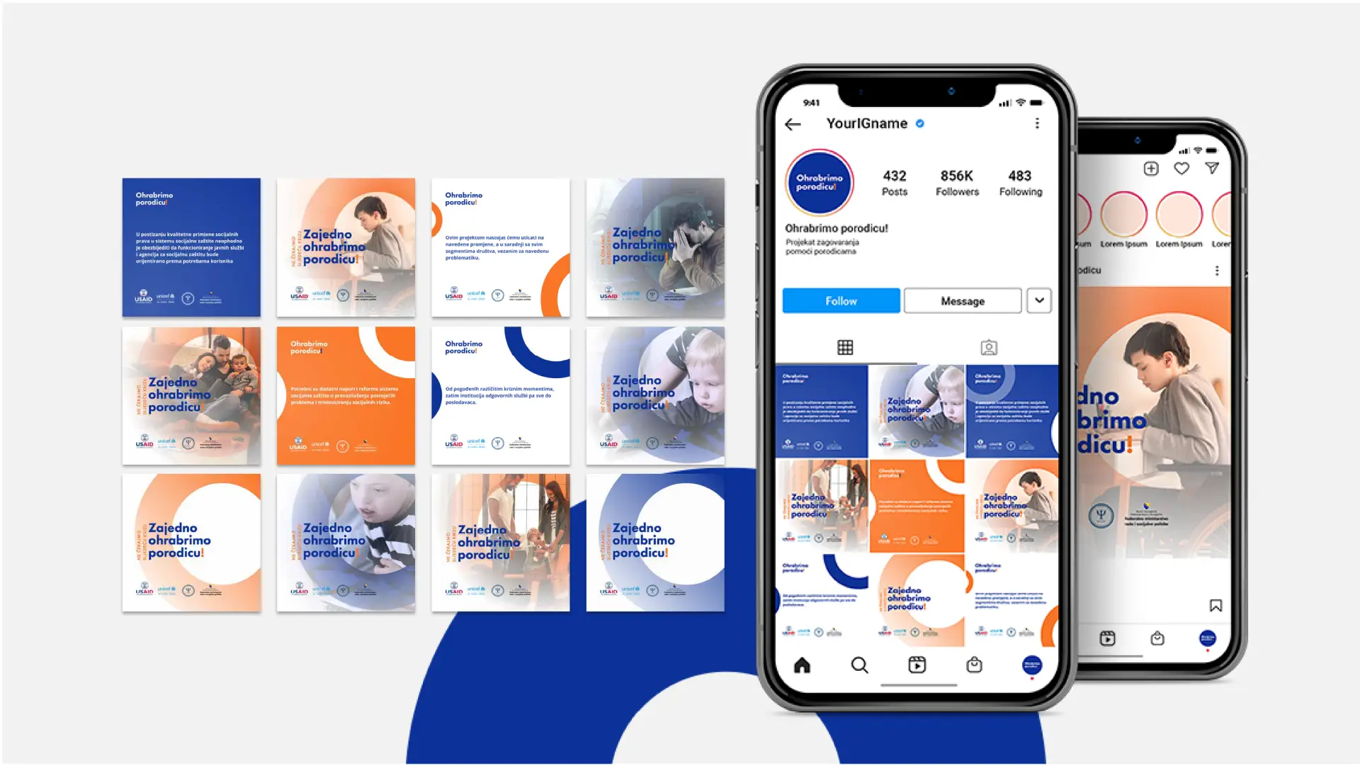
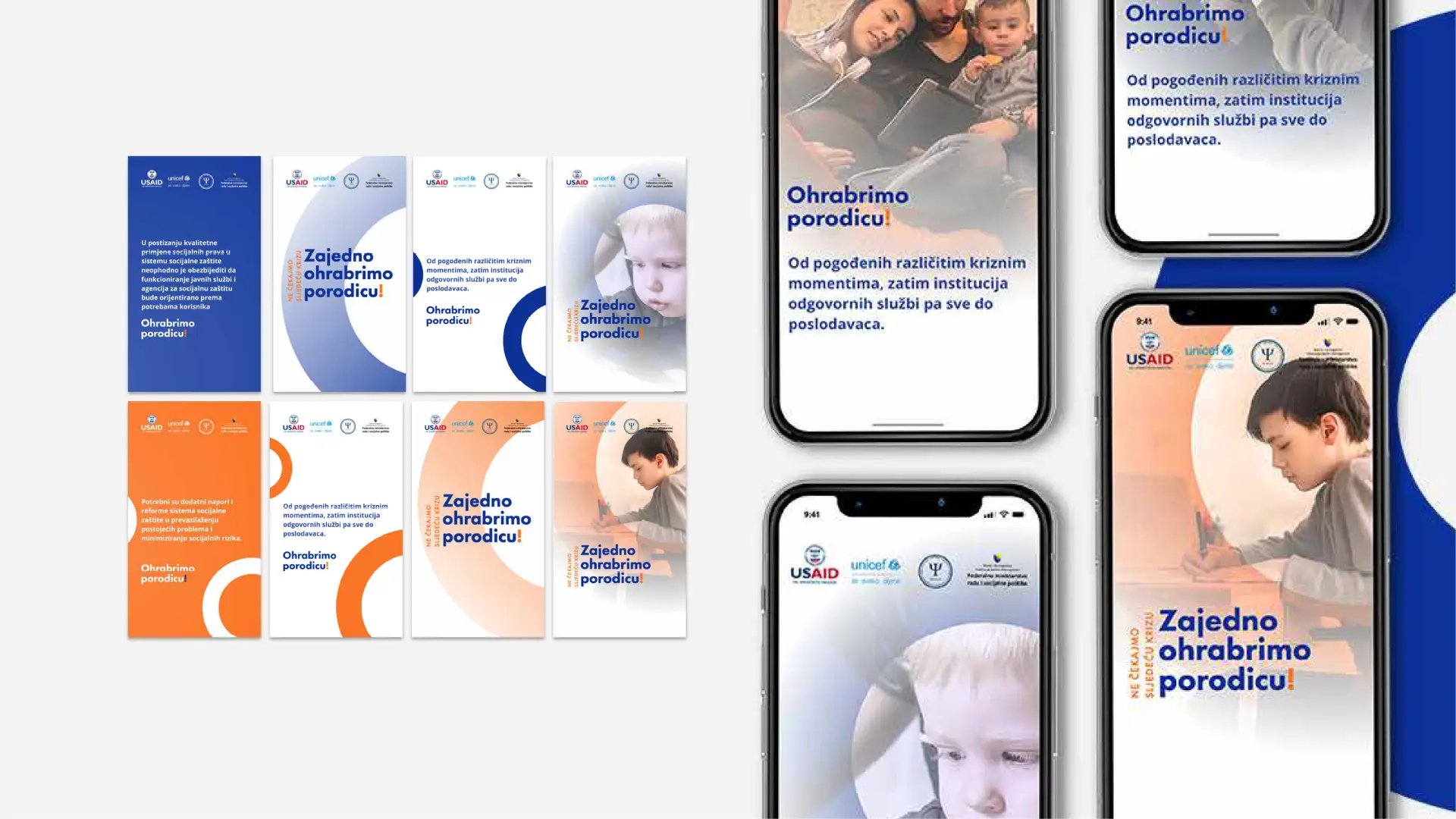
Social media
For the digital component, social media designs were crafted to be emotionally engaging while maintaining clarity and structure. The campaign’s content avoided overloading the viewer with information. Instead, each piece of content was purposefully composed: an emotional photograph paired with a short, meaningful message. The layouts were designed to work across formats—Facebook, Instagram feed, and stories—using mobile-friendly text sizes and compositions that maintain visual hierarchy. The goal was to make users pause and reflect, creating engagement through emotional connection rather than visual noise.
04.
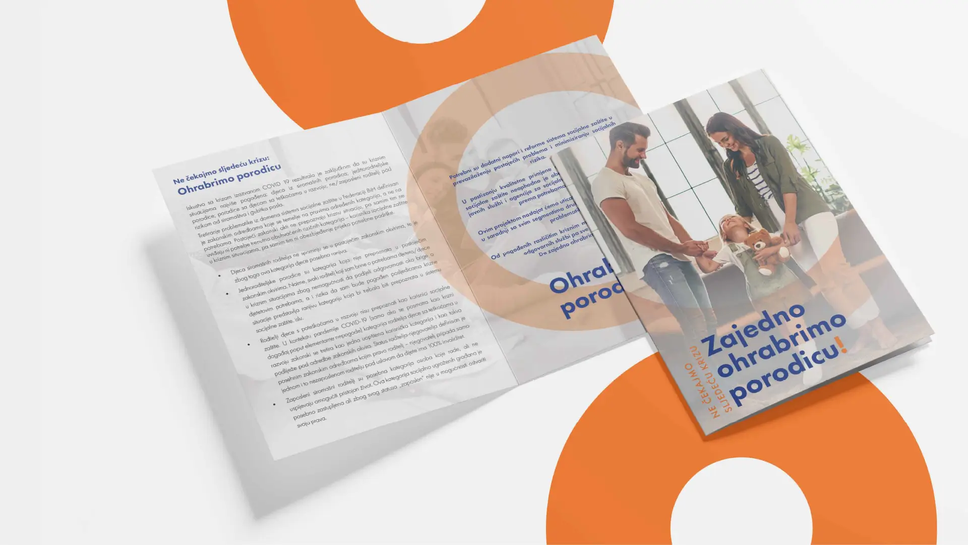
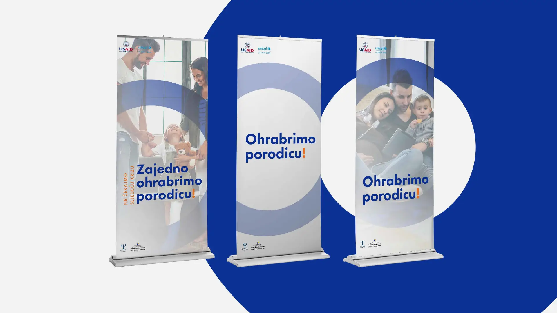
Design for print
The print aspect of the campaign included the design of a roll-up banner intended for public events and institutional presentations. The roll-up design followed the same visual strategy as the rest of the campaign—simple, emotionally clear, and visually balanced. The most important message was positioned at the top in a bold, readable font, while the image served as the emotional anchor. Supporting text and logos were placed with care to maintain both visual clarity and brand consistency. The banner was prepared for professional printing, with proper bleed, resolution, and color profile setup.