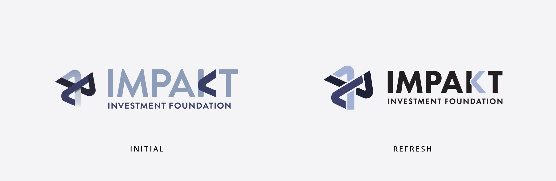
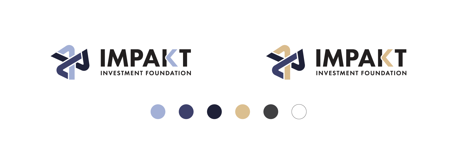
For the IMPAKT Investment Foundation, we had an unusual task that was to technically refine and feel the existing logo of the Foundation.
The idea was to stick to the basic features, symbols, shapes and colors, but to technically arrange the spaces and distances.
We recreated the logo and brought it to a whole new, better look, technically more correct and easier to apply on different surfaces.